Items
Items are the components that comprise each page. There are several different kinds of items that can be added to a page as described in each section below.
Text
Text items can be used as labels or information using static text content, or provide show status through dynamic text that pulls data from the show controller. The Edit Appearance dialog box for text items is shown in Figure 2.
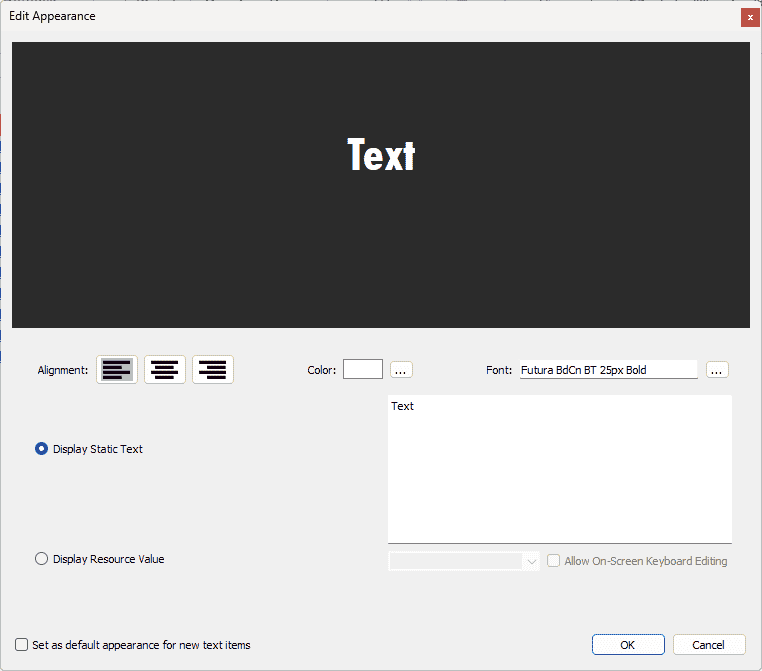
- Example Area: the dark grey area in the top half of the dialog box shows how the text item will be displayed as the style is updated.
- Alignment: select alignment from Left Justified, Centered, or Right Justified.
- Color: the rectangle next to "Color:" displays the current text color. Click the "..." button to open the Select Color dialog box to select a color for the text.
- Font: the field next to "Font: " displays the current text font. Click the "..." button to open the Select Font dialog box to select a font for the text.
- Display Static Text: if this radio button is selected, the text item will contain the text in the white area to the right. The default content for all text items is "Text". Edit this field to change the contents of the text item.
- Display Resource Value: if this radio button is selected, the text item will contain the current state of the selected resource if you are connected in Live Mode. When you are not connected in Live Mode, the text item will contain the name of the selected resource.
- Button: the text item will display either "On" or "Off", depending on the state of the selected button.
- Sequence: the text item will display "Running", "Stopped", or "Paused", depending on the state of the selected sequence.
- Input: the text item will display either "On" or "Off", depending on the state of the selected input.
- Output: the text item will display either "On" or "Off", depending on the state of the selected output.
- Variable, Device variable, or Variable Alias: the text item will display the contents of the selected variable. If the variable has multiple bits to select from, the Bit checkbox will appear below the resource drop-down menu. Checking this box will allow you to select a single bit of the variable for the text item to display.
- Allow On-Screen Keyboard Editing: check this box to allow on-screen keyboard editing.
- Set as default appearance for new text items: check this box to apply all style changes defined in this dialog box to any new text items.
Button
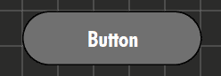
Button items allow for direct control of certain resources in the show controller. The Edit Button dialog box is shown in Figure 4.
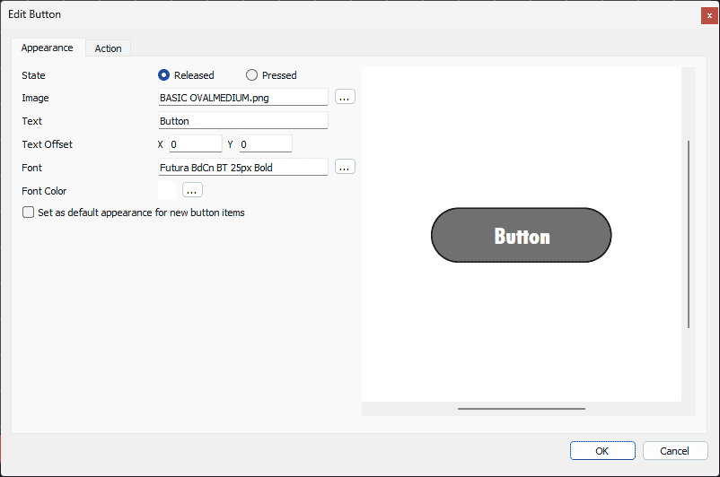
The Edit Button dialog box has two tabs: Appearance and Action.
Appearance
- Example Area: the white area on the right side of the dialog box shows how the button item will be displayed as the appearance is updated.
- State: each button has two states: Released (when the button is not pressed) and Pressed (when the button is pressed). Each state can have a different appearance. Use this option to select the state for which to edit the appearance.
- Image: the default image for buttons is "BASIC OVALMEDIUM.png" for unpressed, and "BASIC OVAL PRESSEDMEDIUM.png" for pressed, which come packaged with WinScript Live. Click the "..." button to open the Select Image dialog box to select images for the button. WinScript Live comes packaged with several buttons in the directory located at "\Users\
<username>\Documents\Alcorn McBride Inc\WinScriptLive 6\Touch 43\Graphics". WinScript Live also supports custom user-generated .png or .jpeg files. - Text: the button will be labeled with the contents of this field.
- Text Offset: the X and Y fields define horizontal and vertical offsets from center of the text.
- Font: the field next to "Font: " displays the current text font. Click the "..." button to open the Select Font dialog box to select a font for the text.
- Font Color: the rectangle next to "Color:" displays the current text color. Click the "..." button to open the Select Color dialog box to select a color for the text.
- Set as default appearance for new button items: check this box to apply all style changes defined in this dialog box to any new button items.
Action
Button Actions allow buttons to actually do something. The Edit Button Action tab is shown in Figure 5.
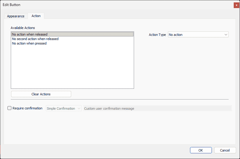
- Available Actions section: each button can have a total of three actions: one action for when the button is pressed, and two actions for when the button is released. The default Action Type is "No Action". Select an action in the Available Actions section to define the Action Type for that action. The following sections go into detail about each Action Type.
- Clear Actions: removes any currently assigned actions.
- Require confirmation: check this box and write a confirmation message in the field to the right to prompt a user with a confirmation when the button is pressed.
Display Page
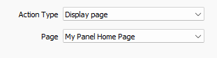
A button can display a page. The drop-down menu lists all pages in the panel as shown in Figure 6. Select a page from the drop-down menu to display that page when the button is interacted with.
Start Sequence
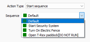
A button can start a sequence. The drop-down menu lists all sequences in the script as shown in Figure 7. Select a sequence from the drop-down menu to start the sequence when the button is interacted with.
Set Variable
A button can set a variable to a specific value as shown in Figure 8.
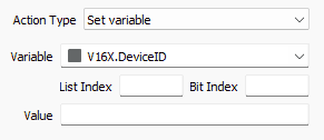
- Variable: the drop-down menu lists all device variables along with user-defined variables in the script. Select a variable from the drop-down menu to select which variable to set when the button is interacted with.
- List Index: select which list index is set.
- Bit Index: select which bit index is set.
- Value: define the value to which the variable is set.
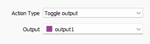
Toggle Output
A button can toggle an output, meaning change from on to off, or off to on, as shown in Figure 9. Select an output from the drop-down menu to select which output is toggled when the button is interacted with.
Turn Output On
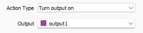
A button can turn on an output as shown in Figure 10. Select an output from the drop-down menu to select which output is turned on when the button is interacted with.
Turn Output Off
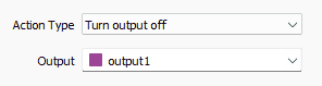
A button can turn off an output as shown in Figure 11. Select an output from the drop-down menu to select which output is turned off when the button is interacted with.
Toggle

Toggle items are simplified versions of button items that change the state of a single binary resource as shown in Figure 13.
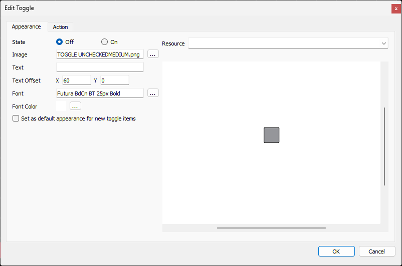
The Edit Toggle dialog box has two tabs: Appearance and Action.
Appearance
- Resource: select which resource to toggle.
- Button/Input/Output: select a button, input, or output to toggle.
- Sequence: select a sequence to toggle.
- Variables/Device Variables: select a variable, and define the List and Bit index to toggle.
- Example Area: the white area on the right side of the dialog box shows how the toggle item will be displayed as the appearance is updated.
- State: each toggle has two states: Off (when the resource is off) and On (when the resource is on). Each state can have a different appearance. Use this option to select the state for which to edit the appearance.
- Image: the default images for toggles are "TOGGLE UNCHECKEDMEDIUM.png" for off, and "TOGGLE CHECKEDMEDIUM.png" for on, which come packaged with WinScript Live. Click the "..." button to open the Select Image dialog box to select images for the toggle. WinScript Live comes packaged with several buttons in the directory located at "\Users\
<username>\Documents\Alcorn McBride Inc\WinScriptLive 6\Touch 43\Graphics". WinScript Live also supports custom user-generated .png or .jpeg files. - Text: the toggle will be labeled with the contents of this field.
- Text Offset: the X and Y fields define horizontal and vertical offsets from center of the text.
- Font: the field next to "Font: " displays the current text font. Click the "..." button to open the Select Font dialog box to select a font for the text.
- Font Color: the rectangle next to "Color:" displays the current text color. Click the "..." button to open the Select Color dialog box to select a color for the text.
- Set as default appearance for new toggle items: check this box to apply all style changes defined in this dialog box to any new toggle items.
Action
The action tab can define a confirmation for the toggle interaction as shown in Figure 14.
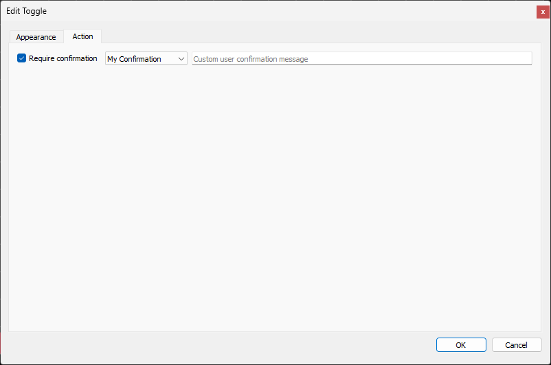
Check the box to require a confirmation upon interacting with the toggle item. The drop-down menu lists all user defined Confirmation pages, along with a default Simple Confirmation, and a field for a custom user confirmation message.
Indicator

Indicator items display a simple binary status of a resource as shown in Figure 16.
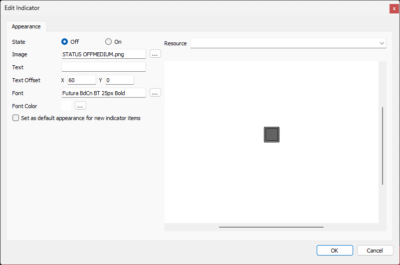
- Resource: select which resource of which to display the status.
- Button/Input/Output: select a button, input, or output of which to display the status.
- Sequence: select a sequence of which to display the status.
- Variables/Device Variables: select a variable, and define the List and Bit index of which to display the status.
- Example Area: the white area on the right side of the dialog box shows how the indicator item will be displayed as the appearance is updated.
- State: each indicator has two states: Off (when the resource is off) and On (when the resource is on). Each state can have a different appearance. Use this option to select the state for which to edit the appearance.
- Image: the default images for indicators is "STATUS OFFMEDIUM.png" for off, and "STATUS ERRORMEDIUM.png" for on, which come packaged with WinScript Live. Click the "..." button to open the Select Image dialog box to select images for the indicator. WinScript Live comes packaged with several buttons in the directory located at "\Users\
<username>\Documents\Alcorn McBride Inc\WinScriptLive 6\Touch 43\Graphics". WinScript Live also supports custom user-generated .png or .jpeg files. - Text: the indicator will be labeled with the contents of this field.
- Text Offset: the X and Y fields define horiztonal and vertical offsets from center of the text.
- Font: the field next to "Font: " displays the current text font. Click the "..." button to open the Select Font dialog box to select a font for the text.
- Font Color: the rectangle next to "Color:" displays the current text color. Click the "..." button to open the Select Color dialog box to select a color for the text.
- Set as default appearance for new indicator items: check this box to apply all style changes defined in this dialog box to any new indicator items.
Action Indicator
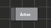
Action indicators are basically buttons combined with indicators, as shown in Figure 18.
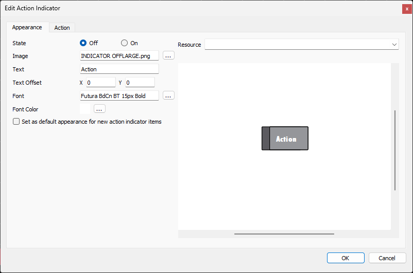
The Edit Action Indicator dialog box has two tabs: Appearance and Action.
Appearance
- Resource: select which resource of which to display the status.
- Button/Input/Output: select a button, input, or output of which to display the status.
- Sequence: select a sequence of which to display the status.
- Variables/Device Variables: select a variable, and define the List and Bit index of which to display the status.
- Example Area: the white area on the right side of the dialog box shows how the action indicator item will be displayed as the appearance is updated.
- State: each action indicator has two states: Off (when the resource is off) and On (when the resource is on). Each state can have a different appearance. Use this option to select the state for which to edit the appearance.
- Image: the default images for action indicators is "INDICATOR OFFLARGE.png" for off, and "INDICATOR GOODLARGE.png" for on, which come packaged with WinScript Live. Click the "..." button to open the Select Image dialog box to select images for the action indicator. WinScript Live comes packaged with several buttons in the directory located at "\Users\
<username>\Documents\Alcorn McBride Inc\WinScriptLive 6\Touch 43\Graphics". WinScript Live also supports custom user-generated .png or .jpeg files. - Text: the action indicator will be labeled with the contents of this field.
- Text Offset: the X and Y fields define horiztonal and vertical offsets from center of the text.
- Font: the field next to "Font: " displays the current text font. Click the "..." button to open the Select Font dialog box to select a font for the text.
- Font Color: the rectangle next to "Color:" displays the current text color. Click the "..." button to open the Select Color dialog box to select a color for the text.
- Set as default appearance for new indicator items: check this box to apply all style changes defined in this dialog box to any new action indicator items.
Action
Action Indicator actions allow them to behave similarly to buttons. The Edit Action Indicator Action tab is shown in Figure 19.
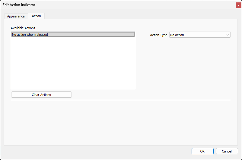
- Available Actions section: each action indicator can have a single action: an action for when the action indicator is released. The default Action Type is "No Action". Select an action in the Available Actions section to define the Action Type for that action. Refer to the Button Actions section for details.
- Clear Actions: removes any currently assigned actions.
Image
Images can be added to a page to really tie the whole thing together as shown in Figure 21.
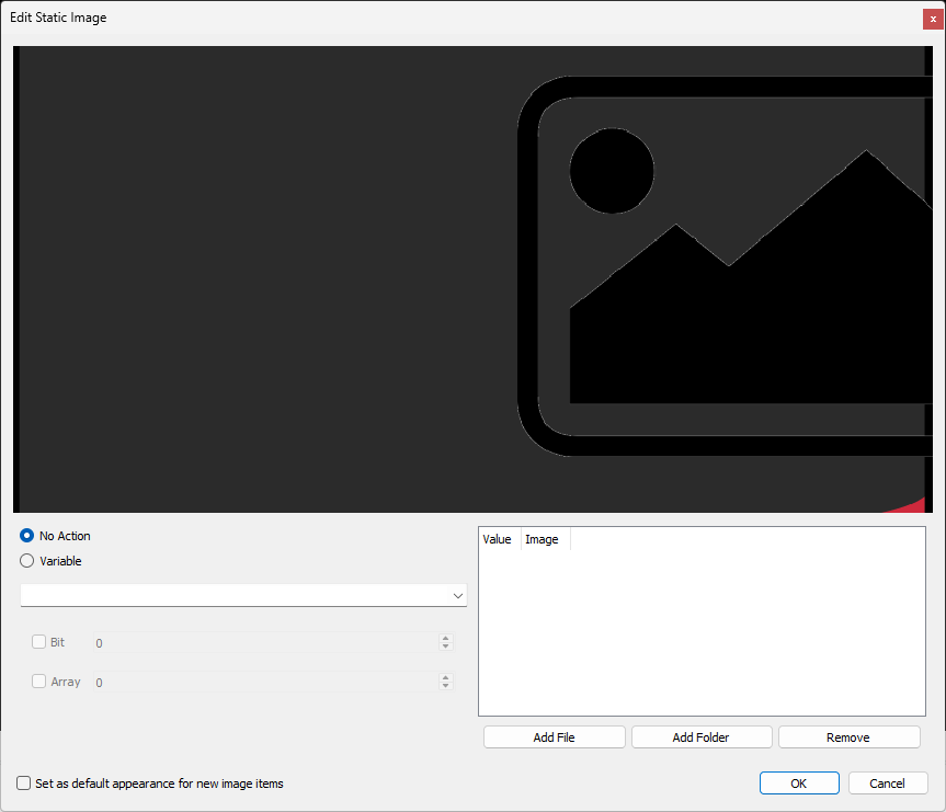
Image items can be static, containing a single defined image, or dynamic, changing the image in the image item according to a variable.
- Example Area: the dark grey area in the top half of the dialog box shows how the image item will be displayed as the style is updated.
- No Action: selecting this option will create a static image item.
- Variable: selecting this option will create an image item that can change the loaded image according to the variable selected in the drop-down. A single bit of the variable can also be used by checking the Bit checkbox and entering the bit value.
- Image List: All images added to the image item are shown here with the value associated with them.
- Add File: this button displays the Add dialog box, which allows you to browse for an image and define the value for this image. The value for each image is used to display that particular image whenever the selected variable equals that value.
- Add Folder: add a whole folder of images to the list. The name of the file is used as the value.
- Remove: removes the selected image from the list.
- Set as default appearance for new image items: check this box to apply all style changes defined in this dialog box to any new image items.
Slider
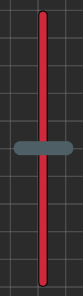
Slider items are inputs for changing the value of a variable along a scale as shown in Figure 23. They are often used for volume sliders or lighting controls.
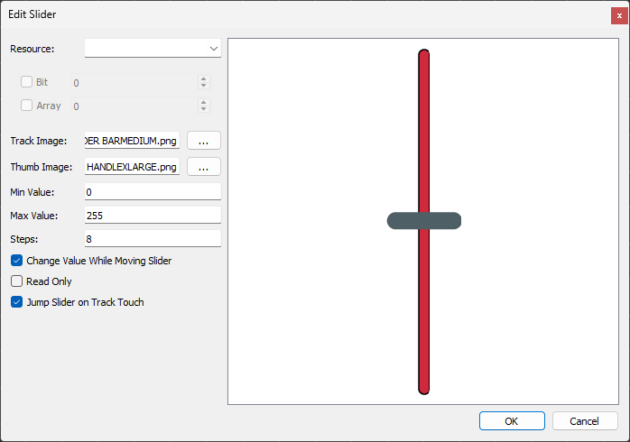
- Resource: select the variable that you want to control.
- Track Image/Thumb Image: the default image is "SLIDER BARMEDIUM.png" for the track, and "SLIDER HANDLEXLARGE.png" for the thumb or knob portion, which come packaged with WinScript Live. Click the "..." buttons to open the corresponding Select Image dialog box to select an image for either the track or the thumb image. WinScript Live comes packaged with several images in the directory located at "\Users\
<username>\Documents\Alcorn McBride Inc\WinScriptLive 6\Touch 43\Graphics". WinScript Live also supports custom user-generated .png or .jpeg files. - Min Value: define the minimum value to which the slider can set the variable.
- Max Value: define the maximum value to which the slider can set the variable.
- Steps: define number of steps from the minimum value to the maximum value the slider can take. The distance between each step is then defined by (max - min)/steps.
- Change Value While Moving Slider: check this box to change the value of the variable while the slider moves. If unchecked, the value of the variable will jump from the value at the start of the interaction to the end.
- Read Only: check this box to have the slider only track the variable value without letting the user input a value.
- Jump Slider on Track Touch: check this box to allow the user to touch a portion of the track to jump the slider to that position. If unchecked, the user must drag the slider to the desired position.
Progress Bar
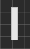
Progress Bar items allow the user view the status of a resource along a scale as shown in Figure 25.
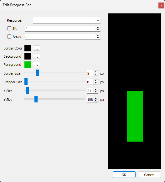
- Resource: select the resource for which we want to display progress. If the resource is a variable with a selectable Bit or Array, those options become useable.
- Border Color: select the color for the border.
- Background: select the color for the background.
- Foreground: select the color for the foreground.
- Border Size: define the size of the border, from 0 to 10 (in pixels).
- Stepper Size: define the size of the steps, from 0 to 20 (in pixels).
- X Size: define the size of the border (in pixels).
- Y Size: define the size of the border (in pixels).
Overlay
Overlays are special items that are actually entire pages that can be designed and added to other pages as items themselves. Once they are designed, they can be used in several pages to allow for using repeating design elements or item layouts, without having to recreate them, page-by-page.
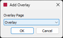
When adding an overlay item to your page, if only one overlay page exists it will be automatically added to the page. If more than one overlay exists in your panel, whenever you add an overlay to your page, the Add Overlay dialog box will appear as shown in Figure 27, allowing you to select which overlay to add.