Creating a Panel
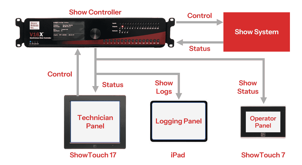
Panel is the name we use for ShowTouch interfaces. Panels are collections of Pages. You can have multiple panels at interacting at the same time with each show controller for different needs. For example, you might provide status to a ride operator, have an iPad running ShowTouch for logging events, and give granular control and status to a technician in the server room as shown in Figure 1.
All panels are designed using WinScript Live. You can find the latest version here.
Panels Resource View
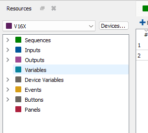
In WinScript Live, open the Panels Resource View by double-clicking on Panels in the Resource View as shown in Figure 2. You can also click Resources > Panels on the toolbar, or by pressing CTRL + SHIFT + P.
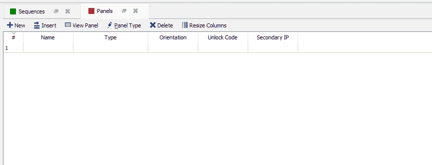
By default, the Panels Resource View has no panels created. This view has several options as shown in Figure 3.
- New: this button will open the Panel Dialog Box to create a new panel
- Insert: this button will insert a new panel above the currently selected panel in the list. By default, the panel is unnamed, the type is showtouch_10, and the orientation is landscape.
- View Panel: this button will open the panel for editing and running
- Panel Type: this button will open the Panel Dialog Box to edit the selected panel
- Delete: this button will delete the selected panel after a confirmation
- Resize Columns: this option resizes columns in the view
The list shows the Number, Name, Type, Orientation, Unlock Code, and Secondary IP for each existing panel.
Creating a New Panel
Click New to display the Panel Dialog Box as shown in Figure 4.
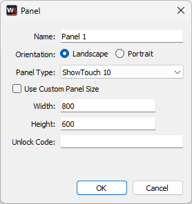
- Name: define a name for the panel
- Orientation: select between Landscape or Portrait
- Panel Type: use this drop-down to select which device you want your panel to target. Options include all three ShowTouch hardware devices, along with several iOS-based devices like iPhones and iPads.
- Use Custom Panel Size Checkbox: if this is unchecked, the width and height of the panel below will change depending on your selection for Panel Type. If checked, you instead define a custom width and height, in pixels.
- Unlock Code: define a code a user must input before interacting with the panel.
Click Okay to finish creating the panel. To open a panel, either double-click on the panel in the list, select the panel and click the View Panel button, or use the drop-down next to the Panel resource in the Resource view to list all panels, and double-click a panel to open.
Panel View
The Panel View is where panels and pages are built. The Panel View is shown in Figure 5.
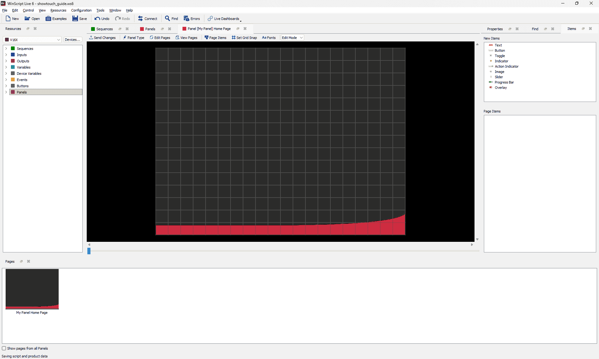
- Toolbar
- Send Changes: this button sends any panel updates to the show controller
- Panel Type: this button opens the Panel Dialog Box for the current panel
- Edit Pages: this button opens the Edit Pages dialog box
- View Pages: this button opens the Pages window (open by default)
- Page Items: this button opens the Items window (open by default)
- Set Grid Snap: this button opens the Grid Snap Dialog Box. Find more information in Designing a Page
- Fonts: this button opens the Fonts Dialog Box. Find more information in Designing a Page.
- Mode Drop-down: this drop-down menu selects between Run Mode and Edit Mode
- Run Mode: this mode allows the user to run the page while connected in Live Mode to a show controller
- Edit Mode: this mode allows the user to edit the page
- Canvas: the area in the middle of the screen is the canvas, where all items are added to bring the panel to life.
- Items: this window on the right side shows the New Items and Page Items sections, which allows you to add items to a page and view which items have already been added.
- Pages: this window at the bottom shows all the pages comprising the panel. The Home Page is created by default when the panel is created. Left-click to swap between pages. Right-click to open the Edit Pages Dialog Box.
Adding and Editing Pages
A panel can have multiple pages, which allows for better organization of status and control. To create or edit pages, open the Edit Pages Dialog Box as shown in Figure 6 by either using the Edit Pages button on the toolbar, or by right-clicking in the Pages window. Alternatively, you can double-click or right-click on an empty area of the canvas and go to Pages.
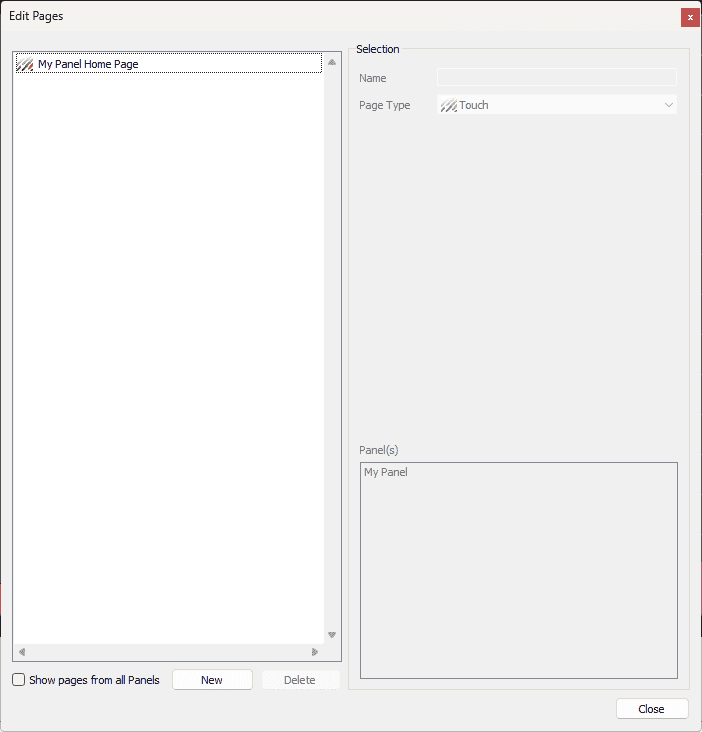
To create a new page, click New at the bottom of the window. The settings for this new page will display on the right as shown in Figure 7.
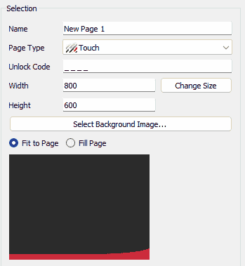
The list of options for each new page depends on what Page Type you select for the page, but common options are defined below.
- Name: define a unique name for the new page. Note: if a page name changes, any page item actions referencing that page will also be updated.
- Page Type: select the Page Type for the new page
- Unlock Code: enter a 4-digit number that a user would need to enter to access the page on the panel
- Width: define the width for the page
- Height: define the height for the page
- Change Size: the Change Size button applies the above defined width and height to the page
- Select Background Image: click this button to open the Select Image Dialog Box. This is a typical file explorer window with shortcut buttons on the bottom to easily navigate to different folders on your machine.
- Clear Background Image: remove the background image selected above
- Fit to page / Fill page: choose whether the background image selected above fits to the page or fills the page.
The other options depend on which Page Type you select, and are described in the following sections.
Note
Several new pages include a button in the center of the page by default. This button, when pressed, will change the current page to the Home Page.
Touch
Touch pages are the default page types in ShowTouch. Most panels comprise mainly of Touch pages. The settings for creating a new Touch page are shown in Figure 8.
Overlay
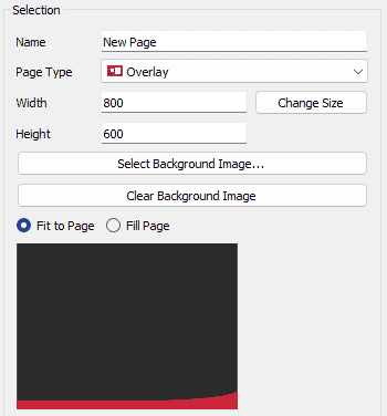
Overlay pages are a special type of page that allow the user to create a reusable set of controls, status, and images. Users design Overlay pages just like a Touch page, but they can be used as items in other pages to simplify panel design. The settings for creating a new Overlay page are shown in Figure 9. See Items for more information about using Overlay pages.
Confirmation
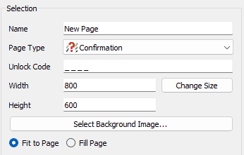
Confirmation pages allow users to make really sure they want to perform a particular touch action. The settings for creating a new Confirmation page are shown in Figure 10. All new Confirmation pages include button items labeled OK and Cancel with a text item that says "Are you sure?"
Web
The settings for creating a new Web page are shown in Figure 11.
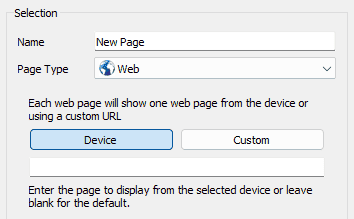
Select between using a Device or Custom web page.
- Device: when using a Device web page, select the device running the web page you wish to display in your panel in the field below.
- Custom: when using a Custom web page, enter the address of the web page you wish to display in the field below.
Warning
The Device Web page functionality is deprecated. Newer Alcorn McBride show controllers, like the V16X, do not support running a web server on the device.
Log
Log pages allow users to display logs from WinScript Live. The settings for creating a new Log page are shown in Figure 12.
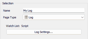
Click the Log Settings button to display more settings as shown in Figure 13.
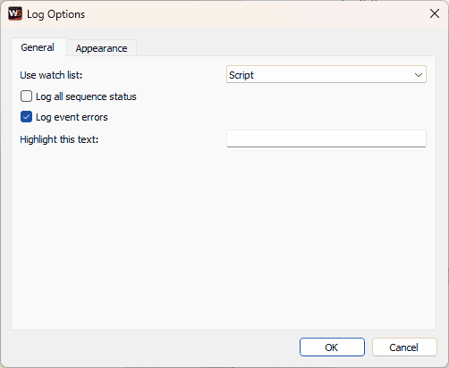
- General:
- Use watch list: select the Watch List to use from the drop-down menu
- Log all sequence status: check this box to log the status (stop, start, pause, loop enable/disable) for each sequence
- Log event errors: check this box to log event errors
- Highlight this text: enter text into this field to highlight it on the log
- Appearance: allows the user to define the Font and customize the text and background colors for each Custom Log Message types
Slide Show
Slide Show pages allow users to create a page that contains a rotating set of images. The settings for creating a new Slide Show page are shown in Figure 14.
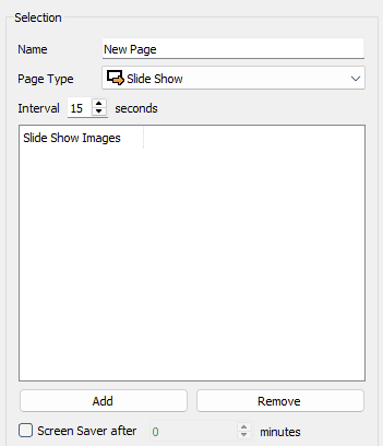
- Interval: time between images in seconds
- Slide Show Images list: displays a list of all images added to the slide show
- Add: click this button to open the Select Image Dialog Box. This is a typical file explorer window with shortcut buttons on the bottom to easily navigate to different folders on your machine.
- Remove: click the button to remove the selected image in the list
- Screen Saver after: checking this box will set this slide show page as a screen saver for the panel after the selected number of minutes.
Actions
Actions are operations your panel can take when certain conditions are met. For example, you can show a page during a particular state of a show, or you can set a variable whenever you navigate to a certain page.
Open the Edit Action dialog box as shown in Figure 15 by either double-clicking or right-clicking in an open area of the canvas and selecting Edit Actions....
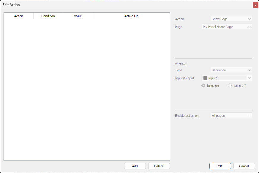
To add or delete an action, click the Add or Delete buttons at the bottom of the dialog box.
Action
The Action section is where you define what action your panel will take. Two page actions currently exist: Show Page and Set Variable.
- Show Page: the Show Page action will navigate the panel to the page selected in the drop-down box.
- Set Variable: the Set Variable action will set a variable to a particular value.
- Variable: select which variable to set.
- List Index: select which list index to set.
- Bit Index: select which bit index to set.
- Value: enter the value to which to set the variable.
- Enable Action on: the action can be enabled on either All Pages, or a selected page.
When
The When section is where you define the conditions under which the action will occur.
- Sequence: the action will occur when the selected sequence either stops or starts.
- Variable: the action will occur when the selected variable with the selected list and bit indices match the defined value.
- Input: the action will occur when the selected input turns on or off.
- Output: the action will occur when the selected output turns on or off.
- Page is shown: the action will occur when the selected page is shown.
- Page is hidden: the action will occur when the selected page is hidden.
- Page is idle: the action will occur when the page is idle for the selected amount of time (in seconds).
- Delay: the action will occur when the page delays for the selected amount of time (in seconds).
Options
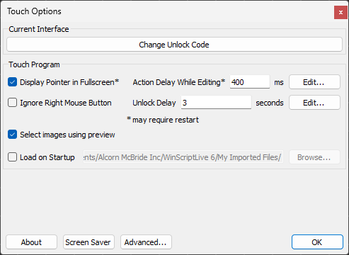
To open the Touch Options dialog box as shown in Figure 16, while in the Panel View, click View on the toolbar, then go to Options.