Designing a Page
Panels usually comprise multiple Pages, built to easily view the status and control the state of resources within the show controller. This article describes how to design a page.
Note
To edit a page, the page must be in Edit Mode. To enter Edit Mode, use the Mode Dropdown on the toolbar to select Edit Mode. Alternatively, you can right-click in an open area of the canvas.
Warning
There is currently no support for undo functionality when editing a page. Please tread lightly when creating and editing your ShowTouch pages.
Items
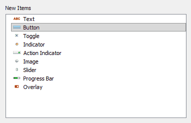
Items are the components that comprise each page. There are several different kinds of items that can be added to a page, as shown in Figure 1.
Add Items
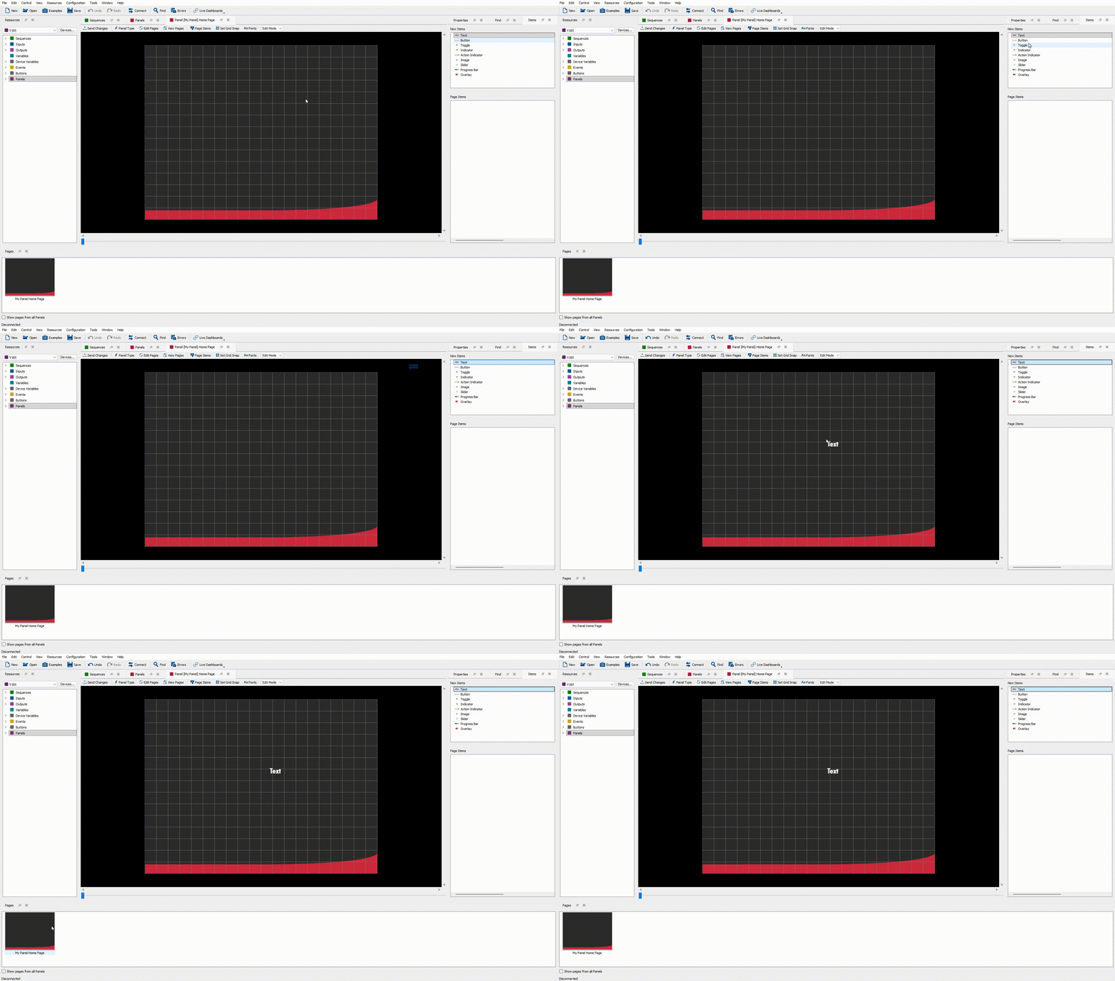
To add an item to a page, simply click on an item in the New Items section of the Items window and drag it onto the canvas, as shown in Figure 2.
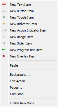
You can also add items to a page by double-clicking or right-clicking in an open area of the canvas and selecting the item you wish to add as shown in Figure 3.
An extensive description of each item can be found in Items.
Edit Items
When you select an item, a dotted red box appears around the item to show which item is selected.
- Move: click an item and hold while you move your cursor to move the item. Alternatively, use the arrow keys with an item selected to nudge the item in a direction.
- Resize: select an item and click and drag the black boxes at the corners of the item outward or inward to resize the item. Alternatively, use the "-" or "=" keys to shrink or grow an item.
- Rotate: select an item and click and drag the yellow curved arrow at the top right of the item in a circular path around to rotate the item. Alternatively, use the "," or "." keys to rotate an item counterclockwise or clockwise. Lastly, you can right-click an item, go to Rotation, then select from 90° Clockwise, 90° Counterclockwise, Nearest 90° snap Clockwise, Nearest 90° snap Counterclockwise.
- Arrange: right-click an item and go to Selection, then Arrange, to move an item forward or backward on the z-axis, or to center the item horizontally or vertically on the page. Alternatively, use the "PgUp" or "PgDn" keys to move an item forward or backward.
- Appearance and Action: right-click an item and go to Edit to edit the Appearance or Action of an item. Alternatively, to copy/paste the appearance of an item, right-click an item and go to Style then Copy Style or Paste Style. Editing each type of item is discussed in detail in Items.
- Delete: right-click an item and go to Selection, then Delete Items to delete an item after a confirmation. Alternatively, use the Delete key on your keyboard to delete an item.
- Copy/Cut/Paste: right-click an item and go to Copy or Cut, then right-click on the canvas and go to Paste to duplicate or move the items around. Alternatively, keyboard shortcuts "CTRL + C", "CTRL + X" and "CTRL + V" work to copy, cut, or paste.
- Convert: right-click an item and go to Convert, then select which item type to convert the item to.
- Edit Key Mapping: right-click an input item (either a Button or a Toggle) and go to Edit Key Mapping to add a hotkey to that item.
Edit Multiple Items
Selecting multiple items at a time also gives a few more options:
- Group/Ungroup: select multiple items, right-click, and go to Selection, then Group or Ungroup, to group or ungroup items together to easily edit them as one item. Alternatively, use the "[" or the "]" key to group or ungroup items. When grouped, they also appear grouped in the Page Items window.
- Arrange: right-click multiple items and go to Selection, then Arrange to select from a plethora of alignment options.
Info
When items are grouped, any actions to move, resize, rotate, copy/cut/paste or delete apply to all items in the group.
Hotkeys
A quick reference of supported hotkey shortcuts are shown in Table 1.
| Hotkey | Action |
|---|---|
| , | Rotate item(s) counterclockwise |
| . | Rotate item(s) clockwise |
| - | Shrink item(s) |
| = | Grow item(s) |
| PgUp | Move item(s) to front |
| PgDn | Move item(s) to back |
| ] | Group items |
| [ | Ungroup items |
| Arrow keys | Nudge item(s) |
| CTRL + S | Save script |
| CTRL + C | Copy item(s) |
| CTRL + V | Paste item(s) |
| Del | Delete item(s) |
Page Items Window
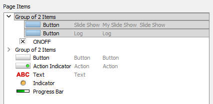
As you add items to your page, the Page Items window becomes populated with each item as shown in Figure 4. This window can be used to select particular items, which can be useful once your page starts to fill up.
Right-clicking an item in the Page Items window will bring up a menu with two options: the Item Menu and the Selection Menu.
Item Menu
The Item Menu allows control of the selected item in the canvas, as shown in Figure 5.
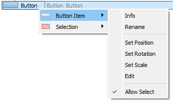
- Info: this option will open the Item Information dialog box, which displays the Name, Type, Position (X, Y), Rotation, and Scale (X, Y) of the item.
- Rename: this option renames the item in the Page Items window for easier reference.
- Set Position: this option allows you to set the exact X and Y (in pixels) position of the item.
- Set Rotation: this option allows you to set the exact rotation (in degrees) of the item.
- Set Scale: this option allows you to set the exact scale (in percent) of the item.
- Edit: this option opens the Edit Appearance/Action menu for the item.
- Allow Select: when this checkbox is checked, the item can be selected on the canvas. If unchecked, the item cannot be selected on the canvas, and appears with a lock icon on the item in the Page Items window
Selection Menu
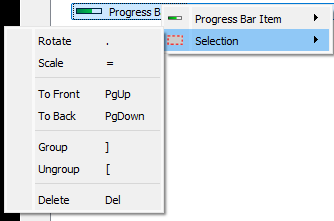
The Selection Menu provides yet another way to rotate, scale, move up/down, group/ungroup, or delete an item as shown in Figure 6.
Editing the Page
Grid Snap
The grid lines that make up the canvas are set by using the Grid Snap dialog box as shown in Figure 7. You can open this dialog box by clicking the Set Grid Snap button at the top of the panel view, or you can double-click or right-click on an empty area of the canvas and go to Grid Snap.
The grid lines act as guides that items can be snapped to in order to make aligning items easier.
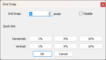
- Grid Snap: set the number of pixels for the grid.
- Quick Set: several buttons for setting the grid snap quickly appear here. Clicking a button changes the value in the Grid Snap field above.
- Disable: check this box to disable the grid entirely, and let your items flow as freely as a retired Steve Alcorn.
Info
Editing the grid snap after items have been placed does not affect the position of those items.
Fonts
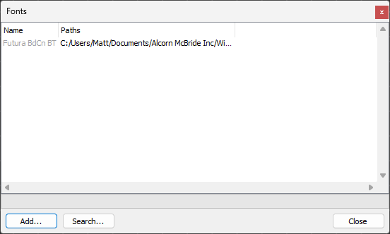
Any Fonts used to style an item will get saved as part of your panel. To see which fonts are currently added, click the Fonts button on the toolbar to bring up the Fonts dialog box as shown in Figure 8.
Background
To edit the background image of a page, double-click or right-click in an open area of the canvas and select Background. This will open the Select Image dialog box, which will allow you to browse for an image to use as the background for the page.